Poison Ivy’s Cocktail Bar

According to Bourriaud (2002:44) “Relational art is not the revival of any movement, not is it the comeback of any style.It arises from an observation of the present and from a line of thinking about the fate of artistic activity. Its basic claim – the sphere of human relations as artwork venue – has no prior example in art history, even if it appears after the fact, as the obvious backdrop of all aesthetic praxis, and as a modernist theme to cap all modernist themes…The space where the works are displayed is altogether the space of interaction, the space of openness that ushers in all dialogue…”

With this in mind, I had planned my own little piece of relational art, in the form of a novelty “pop-up” cocktail bar (Poison Ivy’s Cocktail Bar) which would facilitate audience engagement by inviting them to sample some of the materials which had been used to create the artworks, e.g. foodstuffs and beverages made from bramble, nettle, dandelion etc. Tasting, and hence smelling the food, would give them a multi-sensory experience, an experience  which is being increasingly exploited by artists and galleries throughout the world. One example of this is Jennifer Chung’s Popsy Room in Hong Kong (see the link below)

http://www.lifestyleasia.com/hk/en/culture/art/feature/popsy-room-hong-kongs-first-multi-sensory-opens/

I had created a sign in a typically 1950s style, as this fitted in with the era of the exotic plant collector Alexander Cross living in the grounds, and was an era I had already referenced in my installation ‘The Exotic Seed Company’.

poison-ivy1


IMG_7793A variety of wines made from plants used to make the art were available to taste

I had ordered Nettle, Rosehip and Brambles wines, and also purchased Dandelion, Nettle and Nettle and Bramble teas for those not wishing to consume alcohol.

1-FHHRN0614-20-F107101-FHFNBO614-20-F10804264773

IMG_7834

Making tea!

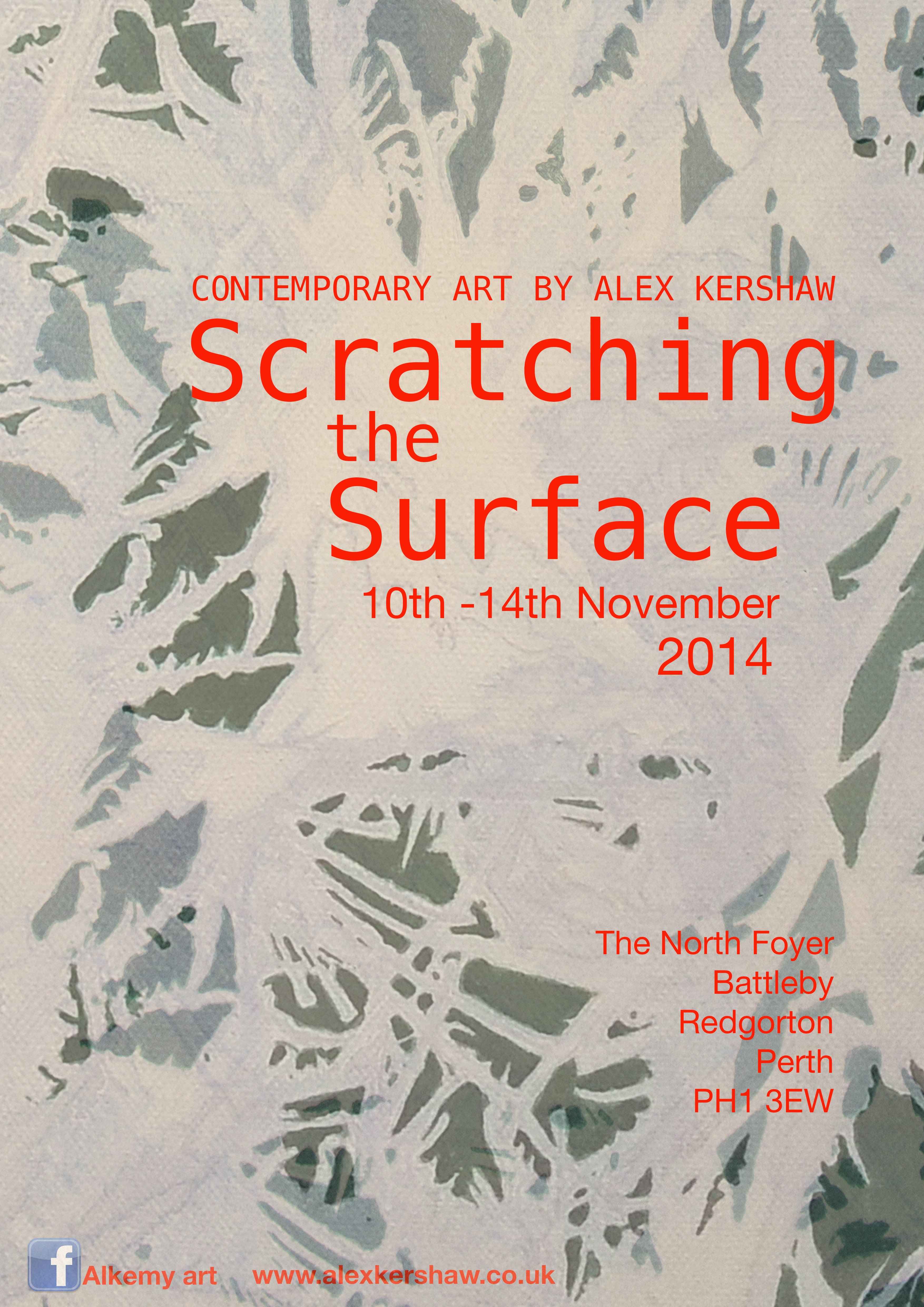
The ‘bar’ opened at 12 noon on Friday 14th November. A steady trickle of guests came into the foyer and lingered around the artwork, taking time to look at all of the pieces. Some came over to the bar, and were offered drinks, which led to discussions about the artwork. Others seemed a bit more shy, in which case I approached them and offered them a drink. It was definitely a great way to break the ice, and also to talk about art and plants, and make a few new acquaintances.

‘Invasion of the Body Scratchers’ fanzines were given out to the viewers, as a souvenir of the exhibition. These also acted as a promotional tool as they had details of my blog and Facebook page on them.

dan

spectator

alex_talking

dan_gardener

alex_pouring

The verbal feedback for my work was very positive, and I think they enjoyed the experience of tasting the plants too. I made apple and bramble crumble (using brambles from the same plant which I had picked the thorns) and this went down very well indeed.

crumble Apple and Bramble crumbles

Written feedback was also encouraged via a comments box, and I was pleased to see that it was all very positive, with some suggestions of other venues where I might exhibit in future, and email addresses left to contact those who wanted information of my future exhibitions.

The experience of creating work, putting together an exhibition and  engaging with the audience was challenging, exciting and informative.The site-responsive element enriched my work, giving it deeper meaning and purpose when it was placed within the location. It is definitely a consideration I will make  when I create work in future.

I feel that I have gained confidence to approach similar environmental organisations with a view to exhibiting or collaborating, and has given me a fresh portfolio of work which I can use as self promotion.

Scratching the Surface – Exhibition up!

On Monday I installed the Scratching The Surface Exhibition at Scottish Natural Heritage Battleby, Redgorton. The exhibition was put together as an assignment for my MA in Fine Art course. The brief – to put together an exhibition in a public place. The deadline – 5 weeks, which isn’t a great deal of time when you’re working and have family commitments!

Given the nature of my work, I decided to contact Scottish Natural Heritage, as this is an organisation that I would like to develop links with, either as part of collaborative research/art projects, or perhaps one day as an artist in residence.

My main interest at the moment is invasive and injurious plants, and after a few ideas, I decided that Scratching the Surface would be a suitable title. Through a bit of research,  I also found out that the site was used as a “hospital” for soldiers to convalesce after the First World War. Given that the plants which I was planning to use for the exhibition had either injurious or healing properties, I felt that this gave my work a site-specific connection, which I aimed to portray within some of my pieces.

posterFINALFLATTENED

The poster which I designed to advertise the event, using a detail of the painting ‘Hostile Invasion’

The work I produced over the 5 weeks was:

  • Masking the Pain : a mask made from nettles, Ivy and other plants

10301543_10205182080733883_3625925428347154536_n

  • PRICK : A word made from thorns on canvas, sprayed with white acrylic

prick

  • Forbidden Fruit : A 3D piece mounted onto canvas, made with polyustyrene, papier mache nails and elastoplast

conker

  • Hostile Invasion : A painting of a hostile, overgrown landscape

10394788_10205182084813985_3821979932975380280_n-1

  • The Exotic Seed Company : An Installation of fictitious seed packets

10523207_10205182081893912_6206547965864657947_n-1

  • No way out : Wire and thorns coming out a of canvas
  • Off side : A painting of a Butterbur Leaf, in the style of stained glass
  • From Scratch : A stylized painting of a bramble stalk

1505478_10205182079213845_3597347468672884481_n

  • Sleeping with the enemy : A bed made from Giant Hogweed, Butterbur, Nettles and Thorns

10686665_10205182085774009_7096075414925306258_n

  • A sign for Poison Ivy’s Cocktail Bar

poison-ivy1

  • A fanzine called Invasion of the Body Scratchers

10805633_10205182087734058_3325535311637312268_n-2

I also made a few more pieces which I did not exhibit, as it was felt that they weren’t strong enough, or devalued other pieces .

I spent all day Monday installing the exhibition, and had a few challenges along the way…covering the picture hanging system to give the exhibtion a more contemporary feel was probably the biggest, so I decided to use canvases to hang over the rods, onto which I then fixed my work.

1487323_10205182088334073_7910188492139245456_n-1

A contrast with lighting gives the exhibition a more dramatic feel (below) but I found it difficult to photograph my work under these conditions

10423978_10205182083413950_4502646111146286564_n-1

I have to say that I’m quite pleased with the result of my work, and its great to see it all up together as an exhibition. On Friday, between 12 noon and 1pm I am hosting a tasting session to sample some of the materials I used to create the artwork, e.g.. Nettle, bramble and rose hip wines, bramble crumble etc. and dandelion and nettle teas. I will be serving the wines as spritzers from Poison Ivy’s Cocktail Bar, and will set up my sign advertising this.

If anyone wants to visit, this exhibition will be on until 2pm Friday, when the 3D works will have to be dismantled due to other events taking place, but the 2d works should be up for possibly another week.

Invasion of the Body Scratchers Fanzine

This is a fanzine I have made to distribute at my exhibition “Scratching the Surface” at Scottish Natural Heritage Headquarters, Battleby, Redgorton.

Print out each of the 4 PDF files below by clicking on the BLUE names, then follow the instructions on how to put it together, folding each page in half then half again.

zine1_16

zine1_16

zine3_14

 zine3_14

zine5_12

 zine5_12

zine7_10

 zine7_10

Zinemaking-folding-folio4

Finally, all you need to do, is staple it together, and voila…you have yourself a copy of Invasion of the Body Scratchers !   If you are still struggling to get it, here is the order of the pages…

zineplan

The Exotic Seed Company

As part of my upcoming exhibition at Scottish Natural Heritage, BattIeby, I had the idea of creating “fake”seed packets of highly invasive and prohibited plants, which was based on the fact that in the past these seeds and plants were distributed in the US and Europe, long before it was realised what a devastating effect these aliens could have on our environment.  Also, in connection with the site of the exhibition, the grounds are listed on the Inventory of Gardens and Designed Landscapes in Scotland, because of the fact that they have a very important exotic plant collection and arboretum, which were planted by and cared for by a team of 10 gardeners when Battleby House was owned by Sir Alexander Cross, between 1947 and 1963. 

I had a look at some vintage seed packets online and found a variety of beauties…

$_35These are from the 1950s….very colourful and well illustrated

44d81aa0f265481f679069ff4b75de8b

Love this anthropomorphism (above), but not really a route I want to go down                      for this piece

a7465164d18781b5010eef85be87faa1

8f0c48555a1954973bcecae688a6c01cKeep coming back to the two above…I think it’s the limited colour palette which I find appealing.

The Exotic Seed Company is a fictitious company which sells these seeds, and advertises them in a lighthearted and positive way, promoting these rogues as hardy, exotic plants which will last forever, with no mention of any regrets you may have later. The typeface is reminiscent of the 1950s, and the adverts typical of this era when political correctness was non-existant, and companies put a positive and most often sexist slant on marketing their products with no evidence to back up any of their claims, in an era when consumerism was on the up and society was ignorant of the detrimental effects these products could have to our health.

8f7ccebe6cc8b58c3ed48f2d80a674ea

6d9b531bc6d7aa46b5eb3da137a44905

 How ridiculous are these strap lines, yet consumers of the 50s would                   have no idea!

I designed three packets, illustrating the 3 current most invasive and threatening plants to our environment in the UK- Giant Hogweed, Himalayan Balsam and Japanese Knotweed. At my tutorial, I was a bit concerned that I may not have enough 2-dimensional work to show, so Caroline suggested that perhaps the seed packets could cover one of the walls, like a sort of installation. I toyed with the idea of this, and also felt that it was important to make the packets by hand, although I know that I could have made much more convincing packets with the aid of the computer, and made them much faster too. Having a love of printmaking, I decided that linoprinting would be a feasible option, so I set about drawing out my designs before getting stuck into the carving.

20141024_140114

Because the packets were relatively small, I soon realised that the lettering would not be easy, and although I managed to carve the plant variety, I felt that the Exotic Seeds lettering at the bottom of the packets did not work…in fact I hated it!

20141024_140217

Luckily, I have a box of alphabet stampers, so instead I opted to stamp Exotic Seeds onto the packets using these – with a much more pleasing result.

20141025_111904

I stuck to the green palette which I have been using throughout the work created for this exhibition, but used a different shade of green for each variety.

20141025_112149

20141025_114502

20141025_130843

Once I had created the seed packets, I decided that I would prefer to see them hanging up on hooks, just as they would be sold in a garden centre. I managed to source a suitable board and some metal hooks, and I painted a sign for the Exotic Seed Company using a 50s style font.

This was them fixed onto the board above the hooks, and the seed were hung up to finish off the piece. I didn’t put any seeds into the packets, although I did think it might make the audience curious, but was concerned that it might be detrimental to the packets, which were made from handmade Lokti paper.

20141102_124013

Finally, I made a two page ad for the Fanzine I am creating, in the optimistic spirit of 50s advertising…

ZINE9

ZINE8 I feel that the end result is quite satisfactory, and hope that it raises questions/debates and provokes curiousity amongst the audience.

Engaging the Audience

Considering the venue, with its history as a hospital, I had thought of a performance of applying first aid to the audience, by way of plasters, bandages or rubbing dock leaves or natural ointments etc to heal any ailments, real or fictitious. However, considering the kind of organization I am dealing with, I felt that it may not be appropriate, and that there may even be some health and safety issues involved.

Therefore, instead I have opted to create an experience for the audience which will allow them to taste some of the materials used in the exhibition. I have decided to serve drinks made from weeds and prickly plants such as Nettles, Rose Hips and Brambles. I may also make bramble crumble which will be served in small paper cases for the guests to sample.

The venue have strict rules about exhibiting and events. If you are hosting an event, then you must pay for the hire of the venue, whereas exhibitions have no cost. I have managed to persuade staff to allow me to serve drinks and nibbles on the final day of the exhibition, and was directed to a small table which I may use for this purpose. The challenge for me is to create a small cocktail bar experience for the audience, which will hopefully have an entertaining element and create an ambience in what are otherwise cold and formal surroundings.  I have access to a gramophone, and although this would have fitted in with the war time era, the volume is uncontrollable, and I feel that this may become more of an annoyance than a pleasure within a small contained space.  I think that I will try to source some music from the era, and have it playing softly at the “bar” so it may give the audience a subconscious connection to the era.

20141017_194605

I created a sign for the bar on a piece of MDF (A1 size) and used vintage typefaces and a portrait, as well as a cocktail glass.  It took me two days to paint, but I felt it was worth doing properly as I may use it again in the future for other events. I was really pleased with the finished sign and feel that it will be the perfect solution to inform the audience what is going on.

poison ivy1

The drinks have been ordered and brambles picked and frozen, so I’m well prepared in the catering side of things. I would really like a soda syphon so that I could create spritzers to accompany the wines which I have purchased, and this would be another valuable prop for the bar which I could be using to make the drinks whilst the audience look on.

I also intend to create a fanzine, of which I will print around 100. these will be available free of charge for those interested. I will also have a wooden box for feedback, which the viewers may write on the back of a postcard which I will distribute.

“Hostile Invasion”

This is a painting I began a few months go. I started out as a kind of frost inspired piece, like the frost which we see on our window panes which has beautiful natural patterns.  It was originally painted in shades of blue, but I was never really happy with it, and had wanted to work into it more. Unfortunately I cannot show you the original photograph as it was lost from my phone.

20141018_155325

I began by spraying over it with white paint, but just enough so that the detail of all the outlines were still visible. Looking closely at it, I began to see many organic looking shapes, and decided that it was not dissimilar to an area overgrown with weeds and injurious plants with thorns and spikes appearing from some of the marks I had made.

20141018_155825

I began to paint into some of the “negative spaces” between the plants and shapes, and found that I could be quite choosy as to what I shapes I could create and emphasise.

20141018_181147


20141018_201730

Finally once I was happy with the composition and amount of shapes I had filled in, I went over everything with one more coat of dark green acrylic. I feel really pleased with the result, and to me it represents a hostile environment of injurious plants such as Hogweed, thistles and thorns.

20141019_172012

Mask

zinemaskThis is a mask I have made using natural materials…Ivy, nettles, hydrangea leaves and daisies.  It has brought me back to the Take Two Influences project which I did in first year, where I used Arcimboldo as one of my influences, and created a mask with plastic bottles using this polystyrene head as a mould.

I began by pinning the materials onto the mould, and when I had decided on a suitable arrangement, I used a small daub of PVA glue to fix them together. All of the plants used with the exception of the daisies are skin irritants. Could this be a mask of pain, or symbolise the agony of those who fought in the war and recuperated here?

I removed the mask from the mould, and was thinking of suspending it, but over the weeks I feel that it has dried out more, and looks very fragile, so I have decided to keep it on top of the mould, and will probably rest it on a plinth, in the spirit of paying homage to something or someone of importance.